Form items
Form items can either be displayed or hidden (for empty items that contain no data) in a form's View state.
Unlike ordinary list items, the form items may have different sizes in the layout but only in the Edit state. A long data field may occupy more than one line in the Edit state, but in the View state it is truncated to the first line.
The user may be able to add and remove form items. This is done with commands in the Options menu.
Form items always have a label. The label has a text part, or a text and a graphical part; however, all items in one form must have the same column layout (see List layouts for detailed information about layouts). Field label cannot be directly edited even if the form is in Edit state. However, it is possible to let the user edit the label text when the form is in edit state. User can choose to edit the label with an option, which can be found in the Options menu.
The form field types that can be used are described in the following table:
| Field | Description |
|---|---|
Text field (alphanumeric or numeric content) |
A text field contains some type of numeric or alphanumeric data. It can be edited directly using the usual editing functions when the form is in the Edit state. The text field can expand to more than one lines if necessary. In the View state, a text field looks identical to a corresponding list item. |
Pop-up field |
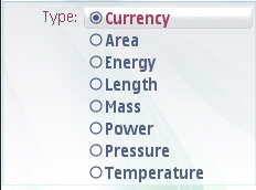
A pop-up field offers the possibility to choose one value from a pre-defined list. In the View state, a pop-up field looks identical to a list item; the text is the current value of the field. In the Edit state, it has a distinct look that identifies the field as a pop-up list. To edit an item in the Edit state, the user can press the Selection key or with single tap (in devices supporting touch), which opens a menu list that contains the available values. The highlight is on the current value. When the list is open, the softkeys are OK and Cancel, as usual with a menu list. Both the softkeys return to the Edit state in the form. A pop-up field may also allow the user to enter a textual value in addition to the pre-defined values. In this case, the last option is named for example Other, and selecting it opens a Data query. See figure below. |
Slider |
With a slider, the user can adjust a numeric value (although it is not necessary to present the actual value to the user as a number). In the View state, the item is presented as a textual item. In the Edit state, the value of the slider is immediately adjustable using the Arrow left and Arrow right keys. |

Figure: Pop-up field
Any combination of these types is possible within one form.
When a form is in the Edit state, the user can move the focus up and down like in a list. The highlight in the Edit state is different from the highlight in the View state, acting as a visual cue. The cursor blinks in the text field that is in focus. There is no need to save each field separately; the user can browse and modify the fields in any order and then accept all modifications. During the browsing of a form in the Edit state, the keypad functions are as follows:
The field types are described in the following table:
| Key | Action |
|---|---|
Arrow up / down |
Move the focus between form items (when in a text field, move the cursor within an item line by line). |
Arrow left / right |
|
Selection key |
|
Left softkey (Options) |
Opens the Options menu (in a form without the Options menu, the left softkey is Done). |
Right softkey (Done) |
Accepts the contents and returns to the previous state (in a form without the Options menu, the right softkey is Cancel.) |
Clear |
|
Edit |
|
Numeric keypad |
|
Other keys |
The default action of the key. |
Using forms in applications
The API to use for creating forms is the Form API. For implementation information, see Using the Form API.