Tooltips
Tooltip is used for providing brief hint about an item, to explain the user’s tasks for the item selected by the user.
An information pop-up is used to display the tooltip.
Information pop-up notes are used to provide additional information to the user, most typically regarding a focused item. Although the Information pop-up can be used in various applications and components, it should not be used too frequently as constantly appearing and disappearing notes may disturb smooth user experience.
The Information pop-up does not have focus, its content cannot be scrolled, and the control always remains in the main pane. The maximum number of rows in the Information pop-up is four. In a typical case, the pop-up emerges one second after the user has taken the focus on an item but has not made any further actions. The pop-up is timed so that it (typically) remains visible for ten seconds or until some event interrupts it. Time-outs are application-specific and variation is possible.
The API to use for the information pop-up is the Info pop-up API. For more information, see Symbian C++ API specifications.
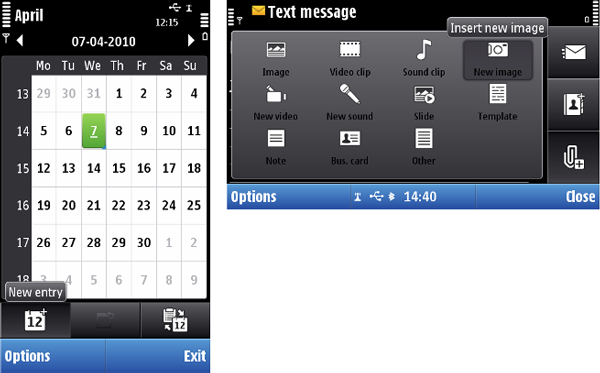
Figure: Example of tooltip
Design recommendation: Tooltips must not be used for items that might open a stylus pop-up menu with touch down and hold.
Note: It is an application's responsibility to design all required texts for their tooltips.
Tooltip appears when the user touches down and holds on an item, that has a tooltip designed, for at least 0.3 seconds. It also appears from a dimmed icon, as it would be displayed in “normal” situation. Tooltip disappears with touch release, when the focus is moved to another item or when the user touches down some other item that does not have a tooltip.
There is no touch interaction with the tooltip item.